From Feature Inventory to Decision Tool: The Integrations Dashboard Redesign
Redesigned a self-service integrations dashboard that lets companies manage connectors, monitor activity, and troubleshoot errors without relying on customer support.
- Enterprise
- Dashboard
- Research
- Desktop
- Role
- Design Lead
- Platform
- Enterprise SaaS
- Monthly Active Users
- 150% Increase
Problem
More Harm than Good
Dashboards are a key part of enterprise software apps. They provide insight on the most critical information so users can ensure everything is running smoothly. However, this was not the case at SAP Fieldglass.
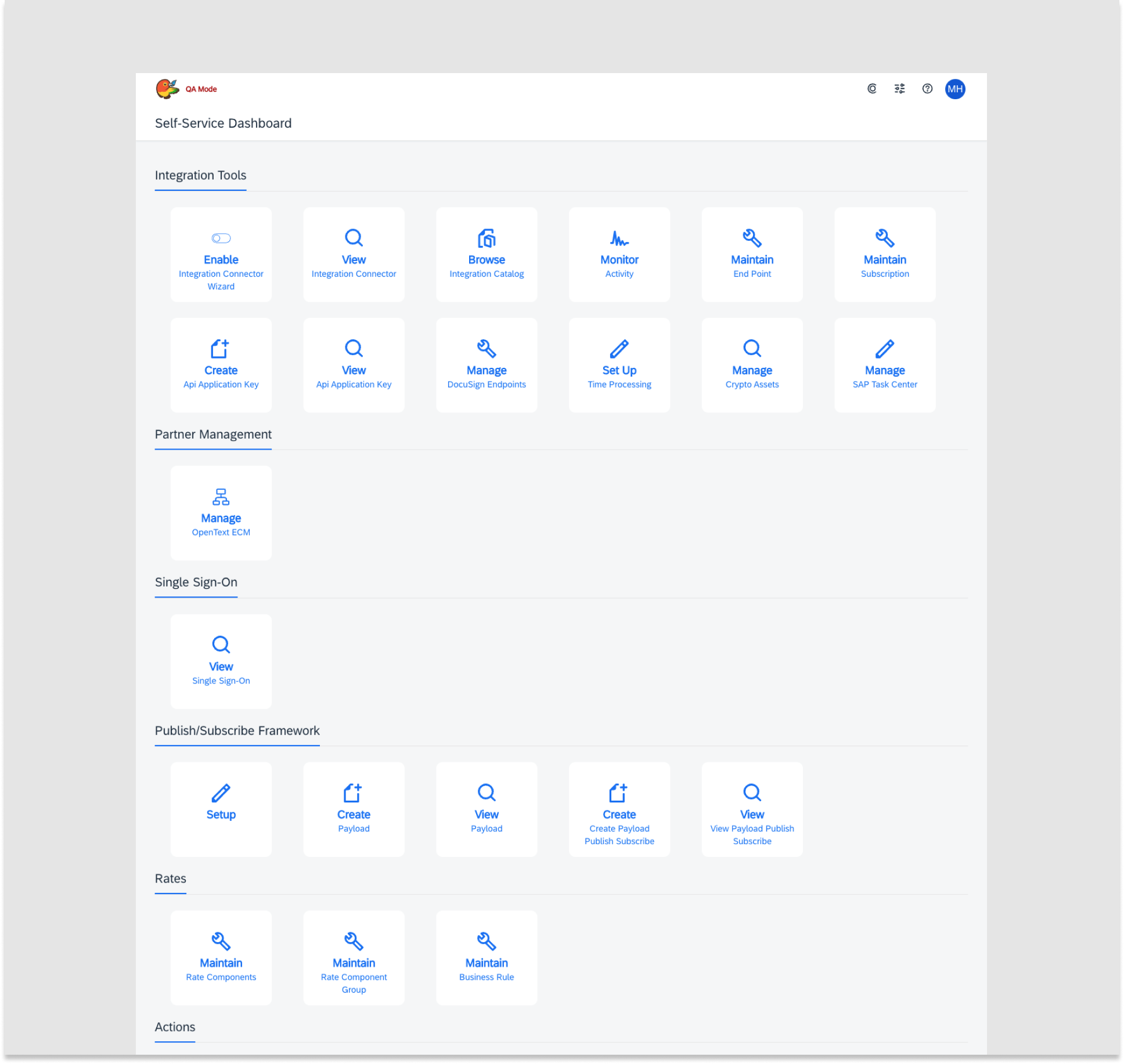
At SAP Fieldglass, The Integration Manager Dashboard gives IT Admins the ability to connect Fieldglass with all of their systems and monitor those connections. However, the dashboard seemed to be doing more harm than good. Engagement levels were low and it was the topic for a large number of help desk tickets.
This was a serious business problem because it created a lack of trust with our customers and negatively impacted their likelihood to renew their license. To fix this problem, and maintain trust with customers, I led a redesign for the dashboard.
Understanding the "Why?"
I had an understanding of the problem at a high level. However, I needed to understand the "why?" behind the problem. Why were engagement levels low and why were there so many help desk tickets being created. Instead of jumping into the designs, I scheduled interviews with the help desk team. This would help me learn what exactly was causing the low engagement levels.
After interviewing the help desk team there were some common themes:
The Issues
Digging for Information
Difficulty in locating important tasks (Monitoring integrations status most mentioned) often clicking into the wrong cards to find what they need.
Information Overload
Users are overwhelmed by the large number of tiles presented on the dashboard and are typically only familiar with a handful of items on the page.
Technical Terminology
Confusion over the terminology that is used in the feature cards. Not all users of the Integrations Manager Dashboard have a technical background and require further explanation.
Digging Deeper with Data
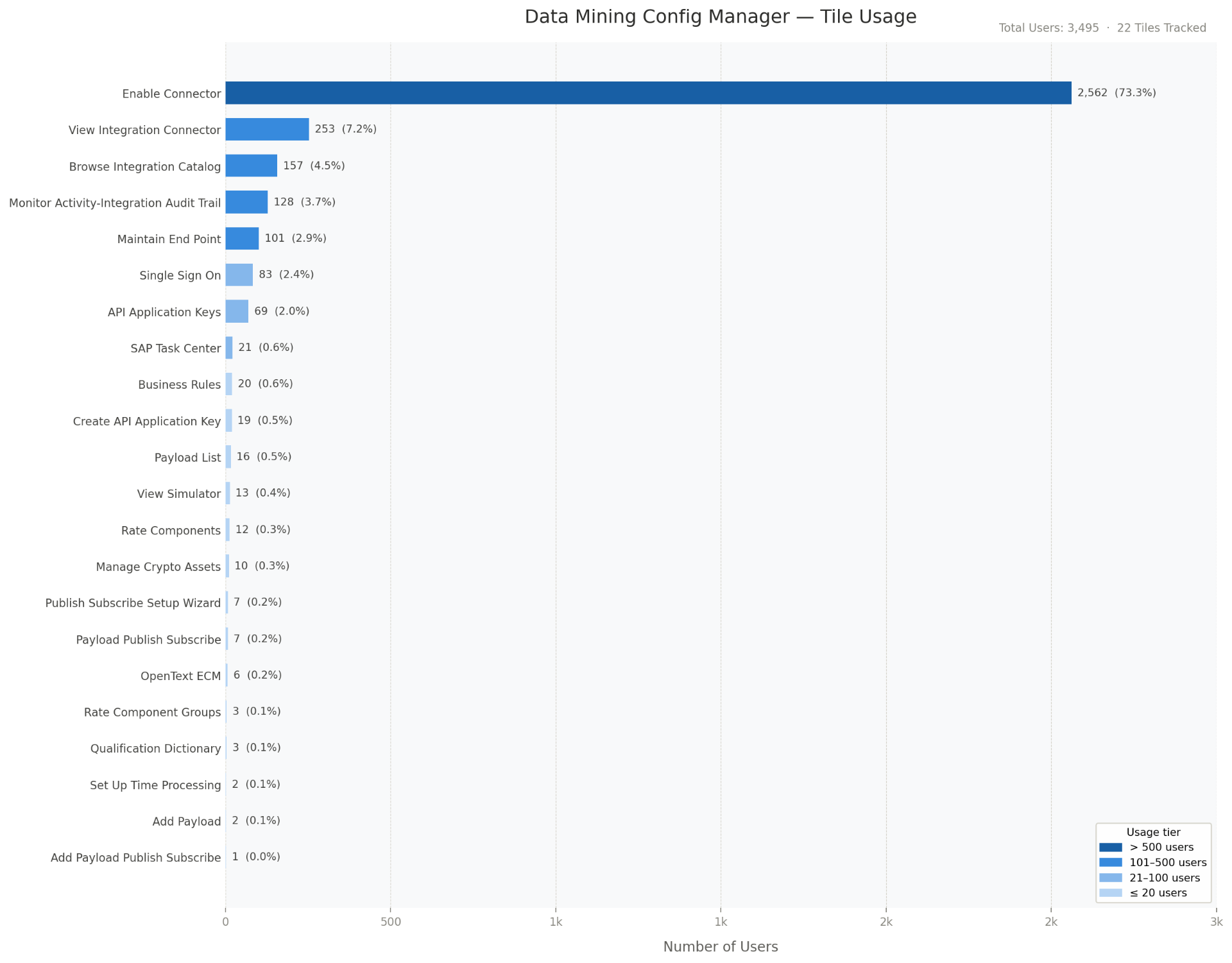
The interviews provided a good idea of the issues, but I wanted to be certain that these issues were true for all users and not just a subset of outspoken ones. To do this, I reached out to the data mining team to learn about the actual tile usage and was surprised by the results. Of the 22 available features, 90% of them were used less than 5% of the time. Although it supported the help desk feedback, I was still surprised to see how little most of them were used.
- 22
- Total Dashboard Features
- 90%
- of Features Used <5% of the Time
The Design Decisions
This research translated into three clear goals for the design, each one aimed at addressing a specific failure of the original dashboard.
Surface What Matters Most
The most common reason customers visited the dashboard was to set up and monitor their integration health, but the existing design forced them to leave the page and filter through records to find errors. It was important to make sure this information was front and center.
Improved Dashboard Organization
Research confirmed that customers relied on a small subset of features. Creating a more personalized workspace that is efficient to navigate would help make the dashboard less overwhelming. Less noise, more signal.
Simplify for Non-Technical Users
The existing features were not easily understood by all users. It assumed that all users had the same level of technical knowledge. It was important to ensure all users feel more confident when working inside the dashboard.
Bringing Ideas to Life
With the goals in mind I got started on building concepts. I conducted research on dashboard best practices and gathered inspiration across different products.
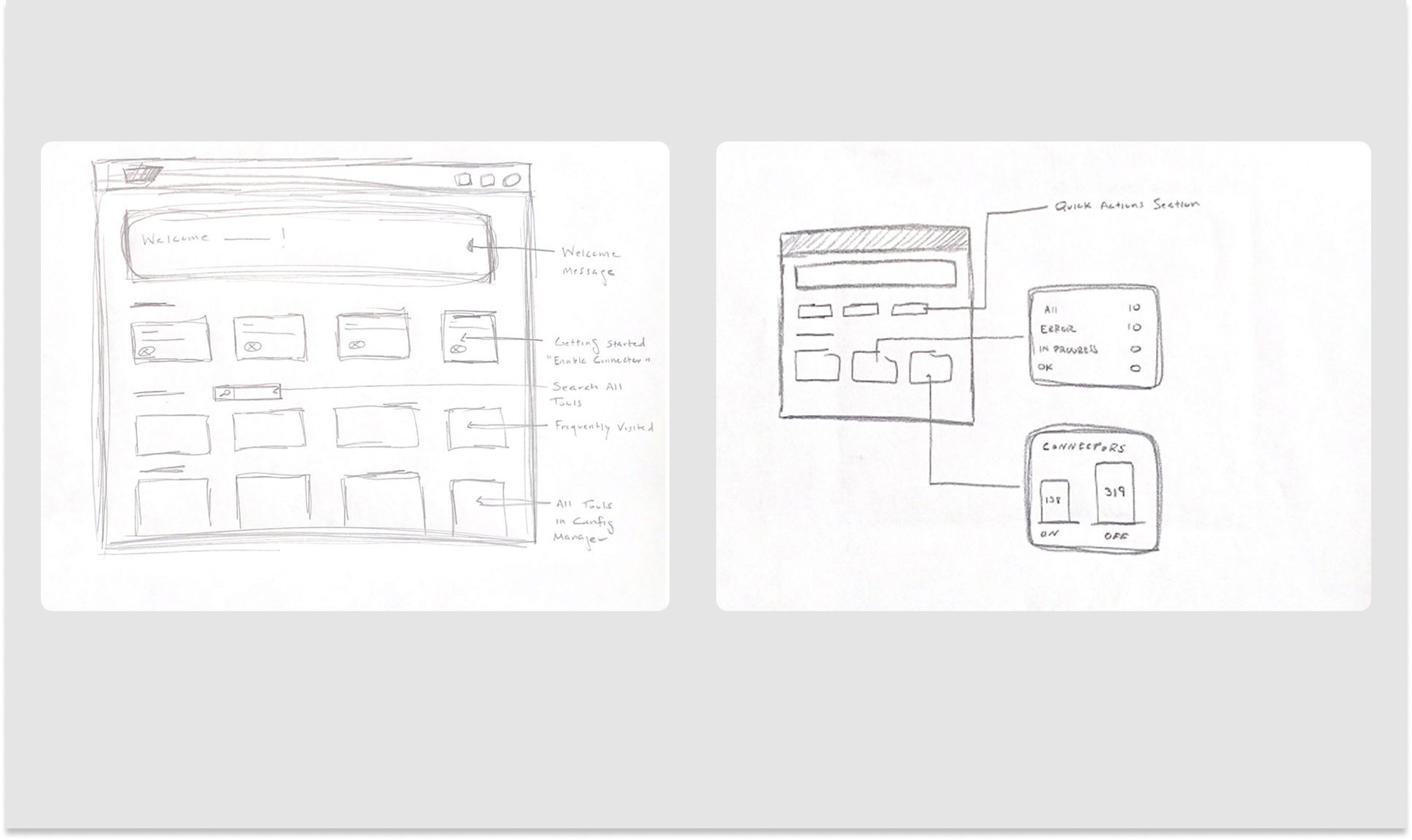
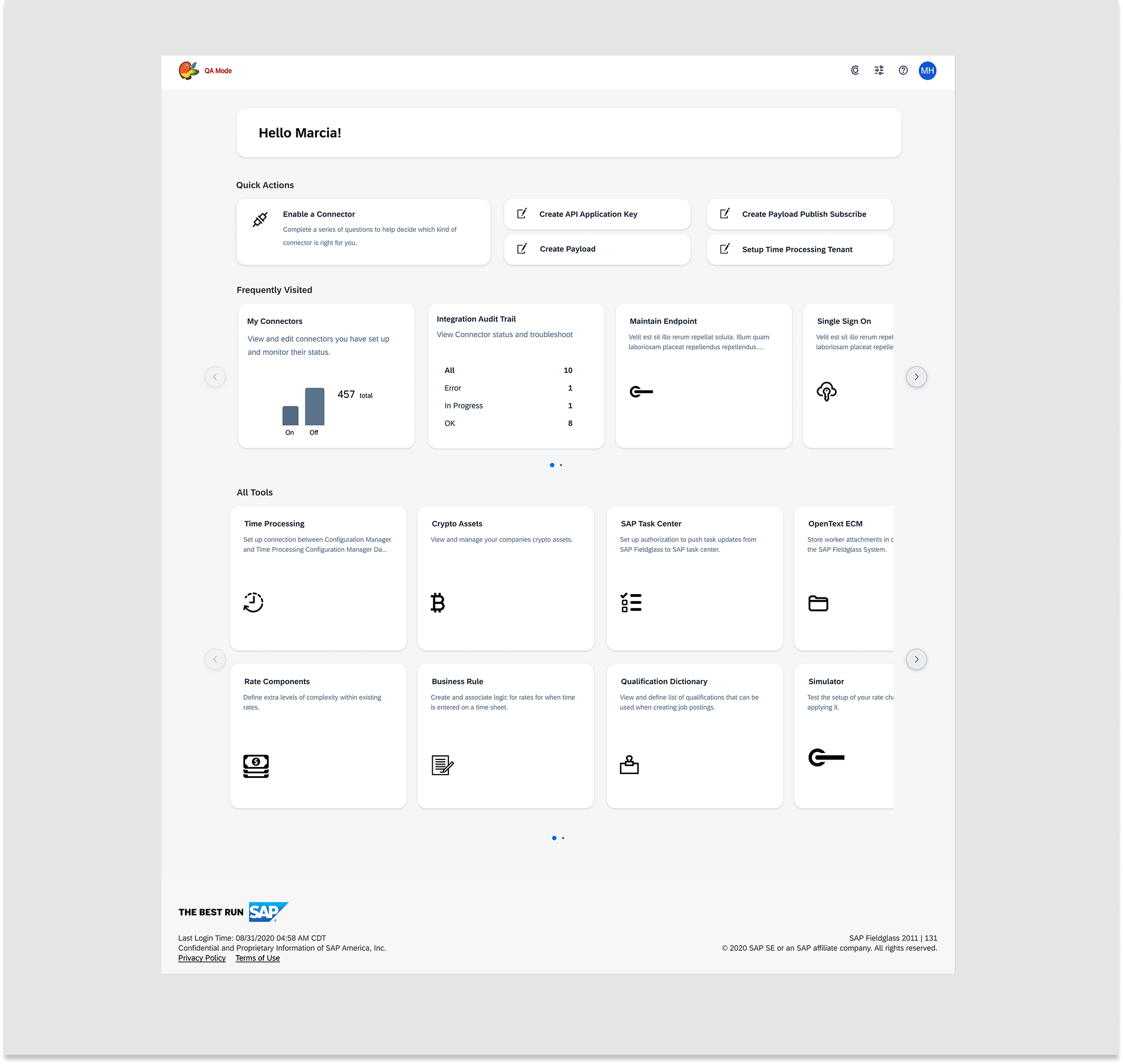
I started with pen and paper to get all of the initial ideas out on paper quickly. From there I built wireframes to make them more presentable and share them with my team.
Stress-Testing the Design with Real Users
After presenting the wireframes to my team and gathering feedback, I iterated on the designs. Once the changes were in place I built a high-fidelity interactive prototype to share with real users.
Alongside a UX researcher on my team, we conducted usability sessions with sixteen participants across four different companies. None of the participants had trouble accomplishing the objectives we had tested, and the feedback was overwhelmingly positive. This was the validation we needed to move forward with releasing the designs.
I think I would actually use it more if I had it like this.
Being able to monitor activity and see errors from the dashboard is very helpful.
This is so much cleaner and easy to view.
A Dashboard Built for the People Using It
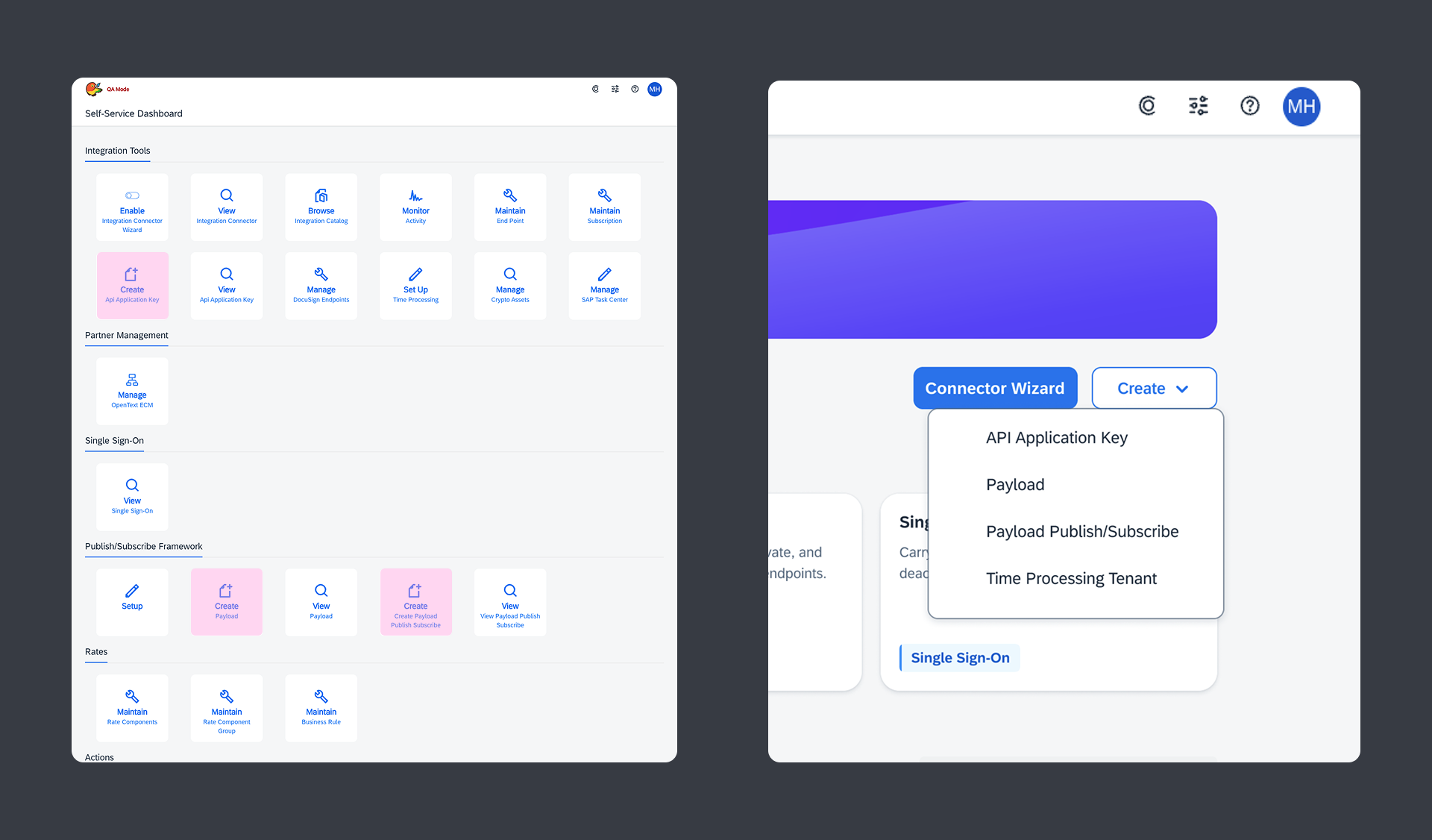
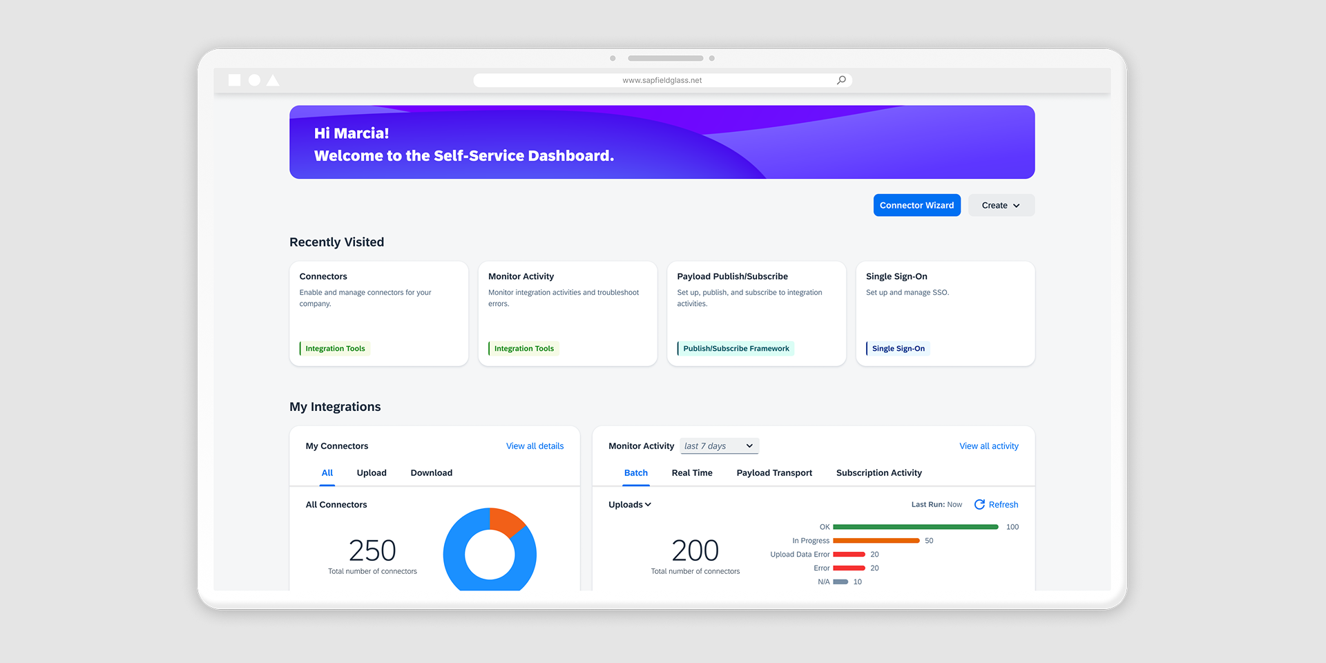
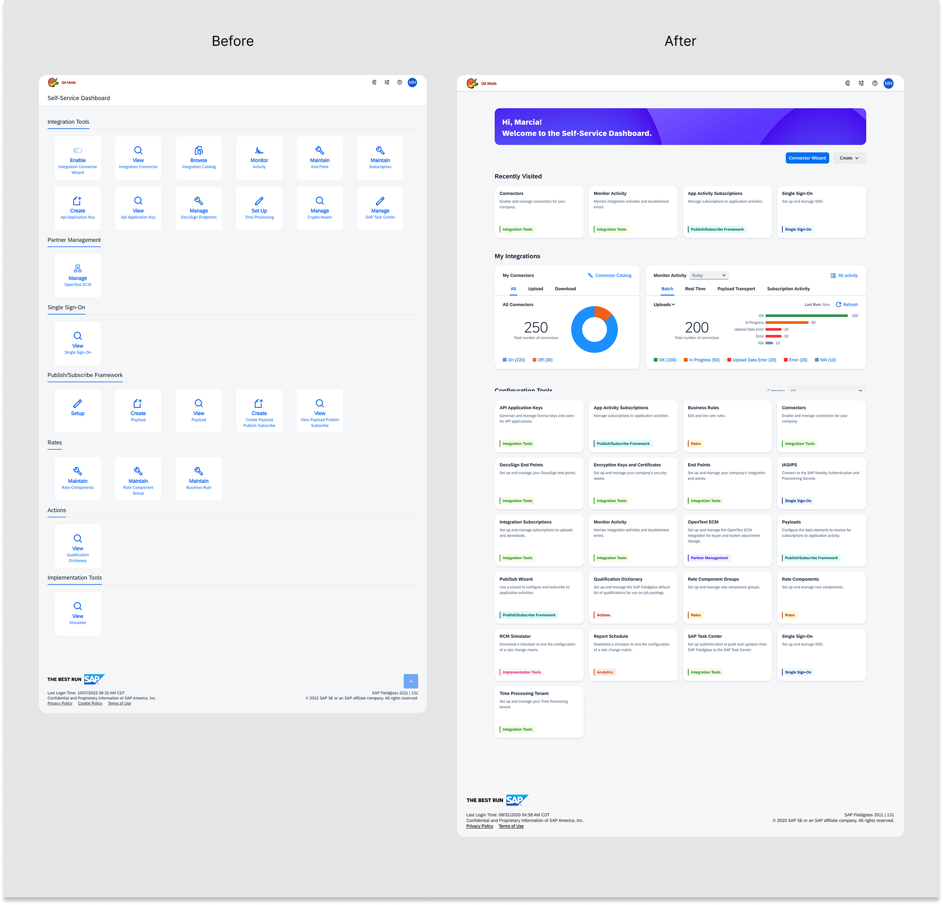
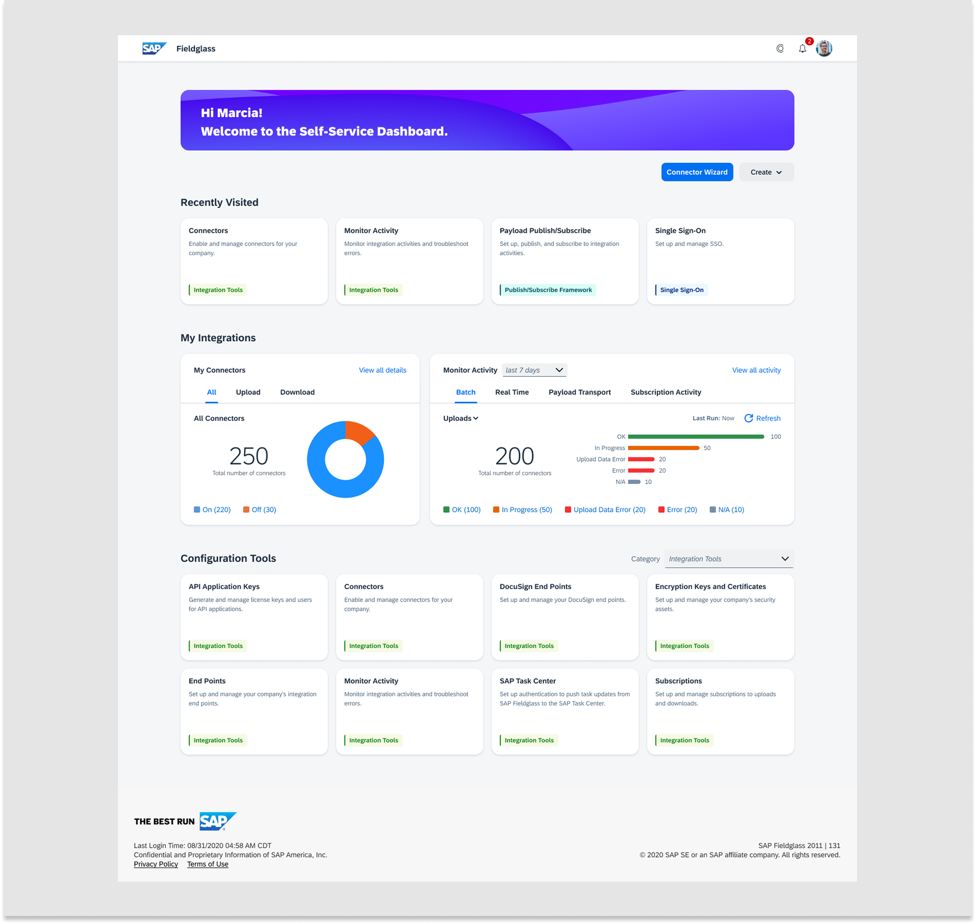
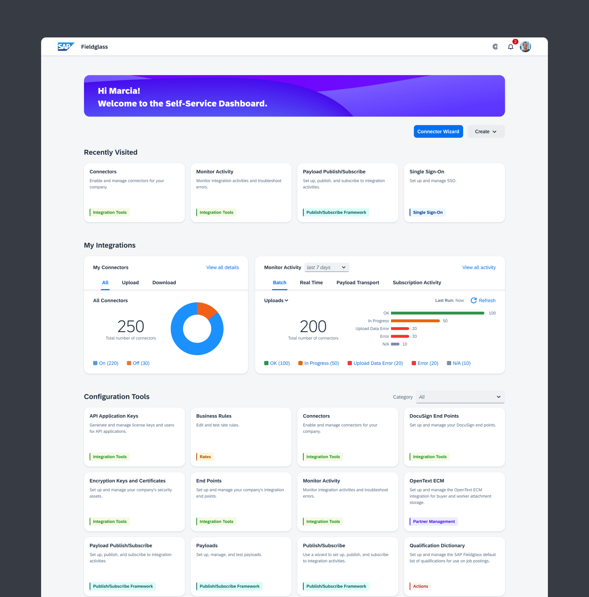
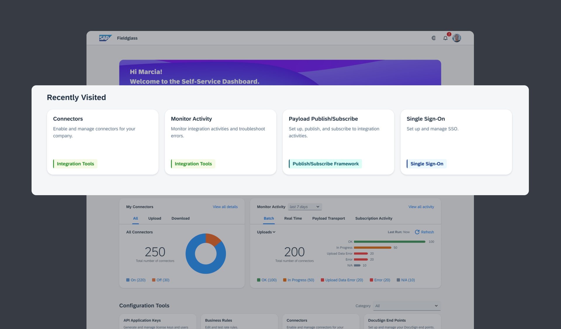
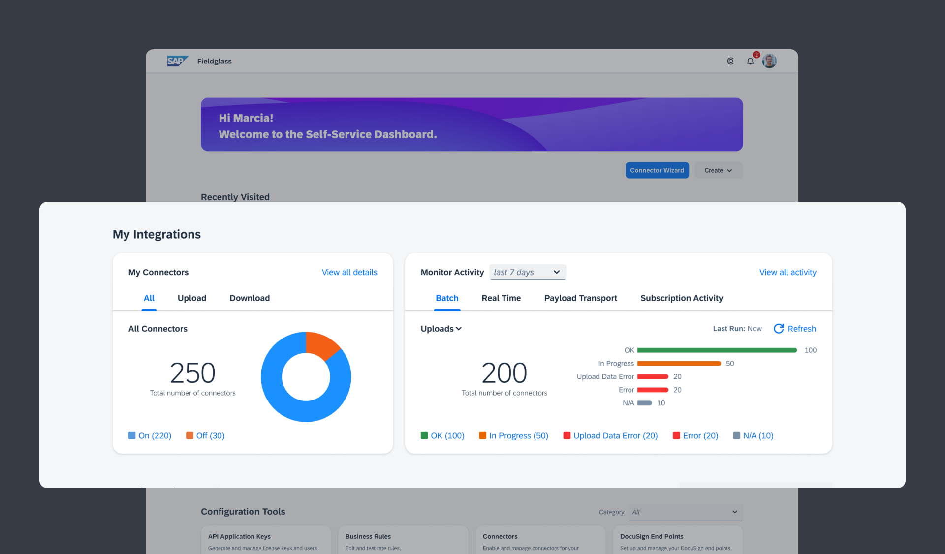
The redesign helped integration managers do their job faster and reduced frustration among customers. It featured a "Recently Used" section based on each user’s workflow. Beneath it, data visualization widgets provided instant visibility into integration status. This was what customers needed most, now front and center without any extra clicks. A unified Create button reduced the overall number of tiles and visual clutter while preserving full functionality. Lastly, category filters allowed users to find tiles in seconds rather than scanning the entire grid.
The result was a tool built for the people using it.
Recently Visited
Integration Widgets
Create Menu