SAP Time Entry Mobile App
From Dreaded to Done: how one feature transformed time entry for field workers. A ground-up redesign of a weekly time reporting app with 100K+ users, turning a frustrating experience into a fast, seamless process.
- Mobile
- Research
- Usability Testing
- Enterprise
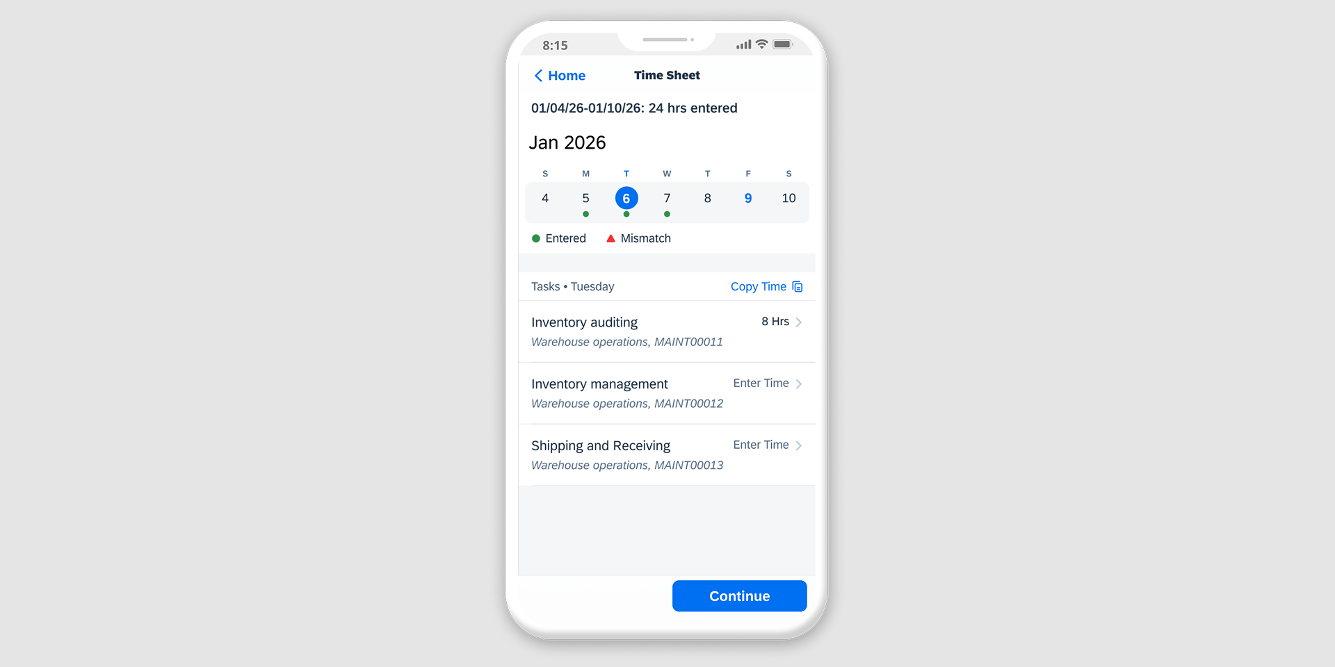
Problem
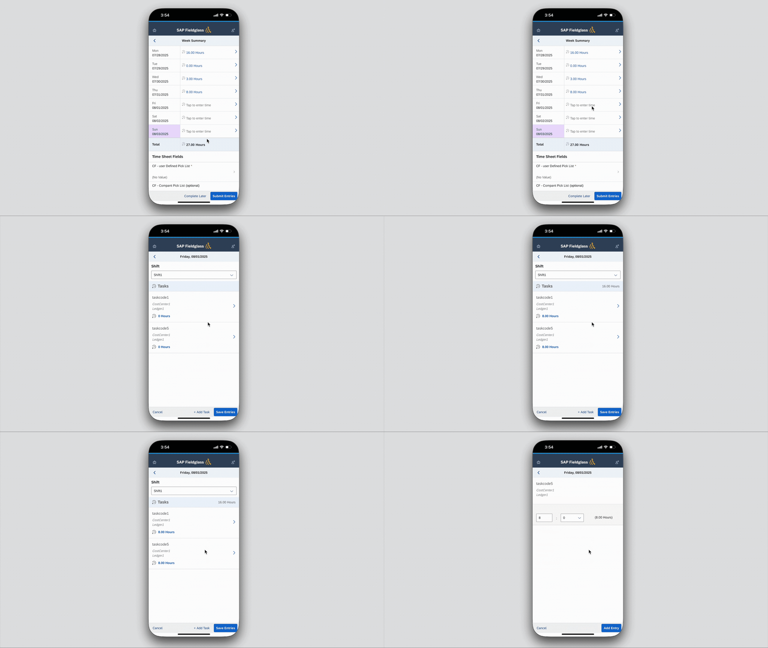
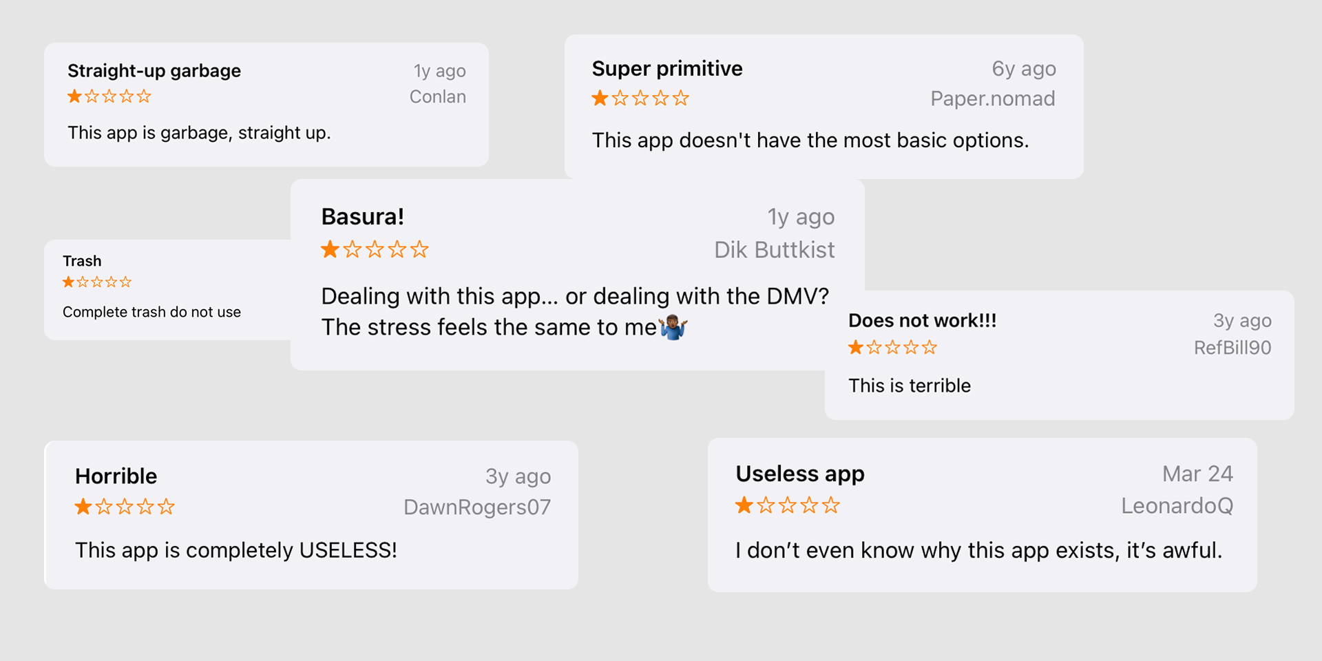
The SAP Time Entry Mobile App helps workers submit their time sheets "on the go" — intended to help workers on job sites that don’t have access to their computers. However, the mobile app received hundreds of poor reviews in the app stores because it made entering time more difficult. This cost the company both reputation and efficiency, signaling a clear need to reimagine the experience from the ground up.
Outcome
- 3x
- Faster Time Entry
- 4.4/5
- Ease of Use Rating
- 200%
- Increase in User Satisfaction
From slow and tedious time entry to just a few clicks
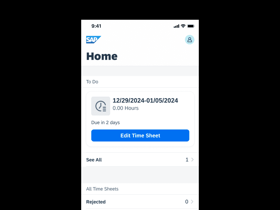
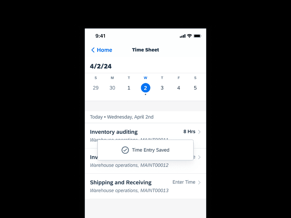
To address this issue I led a ground-up redesign for a new mobile application. The new designs improved overall satisfaction and significantly reduced the time it took for workers to submit their time sheets.
Using AI to automate research and establish more accurate goals faster
I began manually recording reviews from the App Store and Google Play store to try and capture all of the feedback that was out there. However, with thousands of reviews this became too tedious.
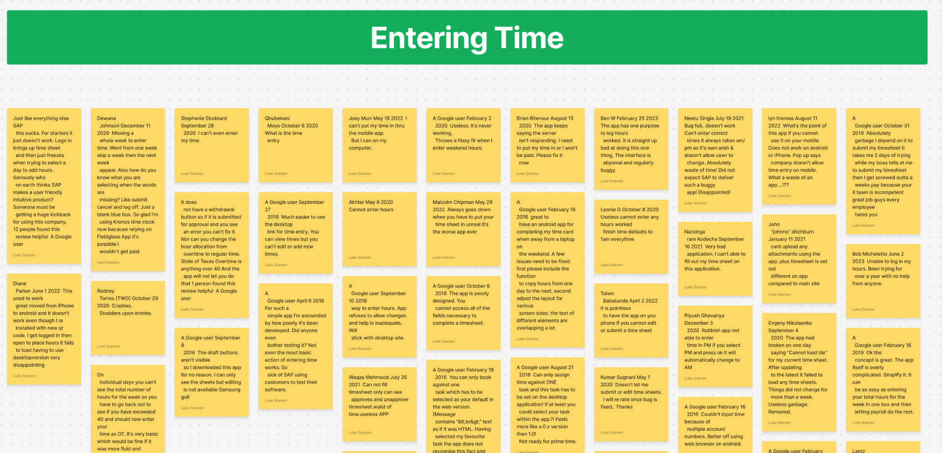
To efficiently synthesize the data, I reached out to the data science team for help. We pulled each review and summarized the findings using AI. This led to faster and more accurate data analysis. After extracting the most common problems workers faced, we were able to establish clear goals.
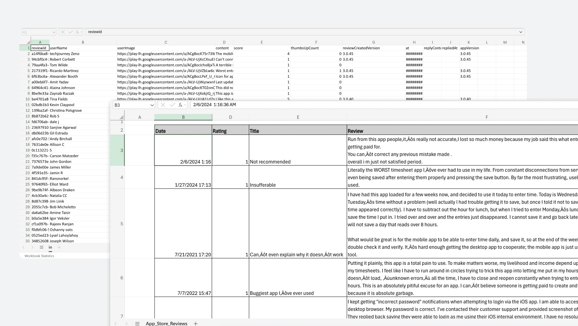
Goals
- Faster Time Entry
- Prevent Information Overload
- Adopt Modern Design Patterns
Capturing worker sentiment through journey mapping
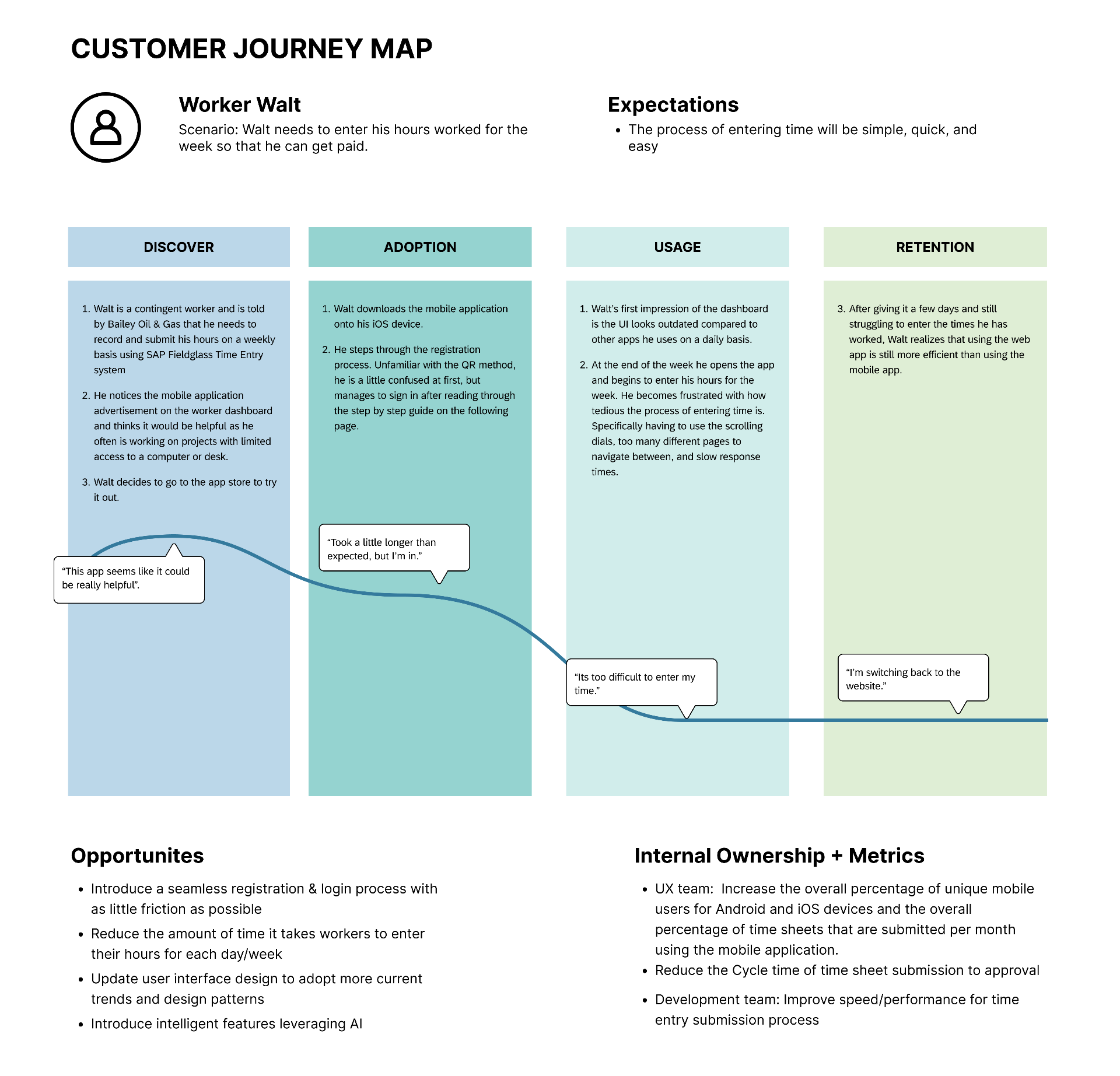
After having a better understanding of what was making workers the most frustrated, I created a journey map to visualize the steps and touchpoints for our workers. This helped uncover pain points and identify the biggest opportunities for improvement.
Key improvements to speed up time entry and reduce cognitive load
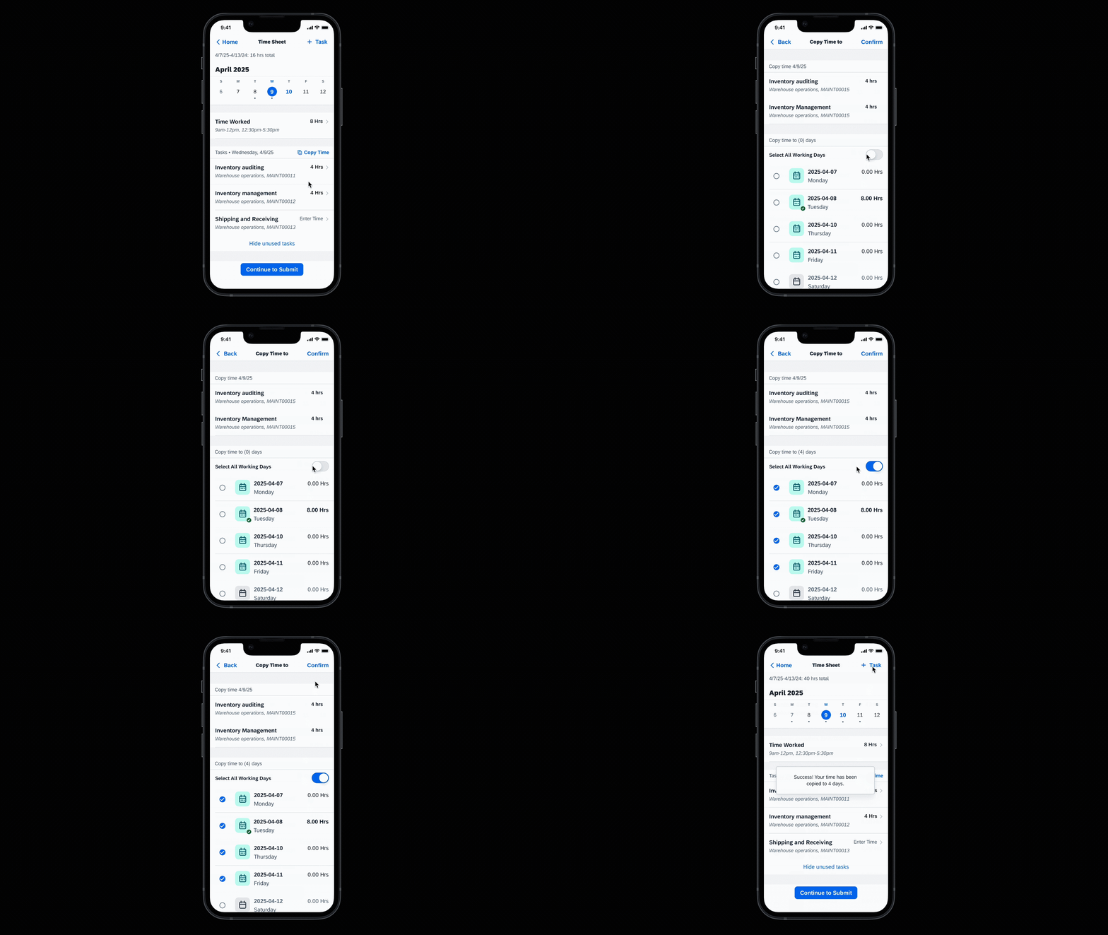
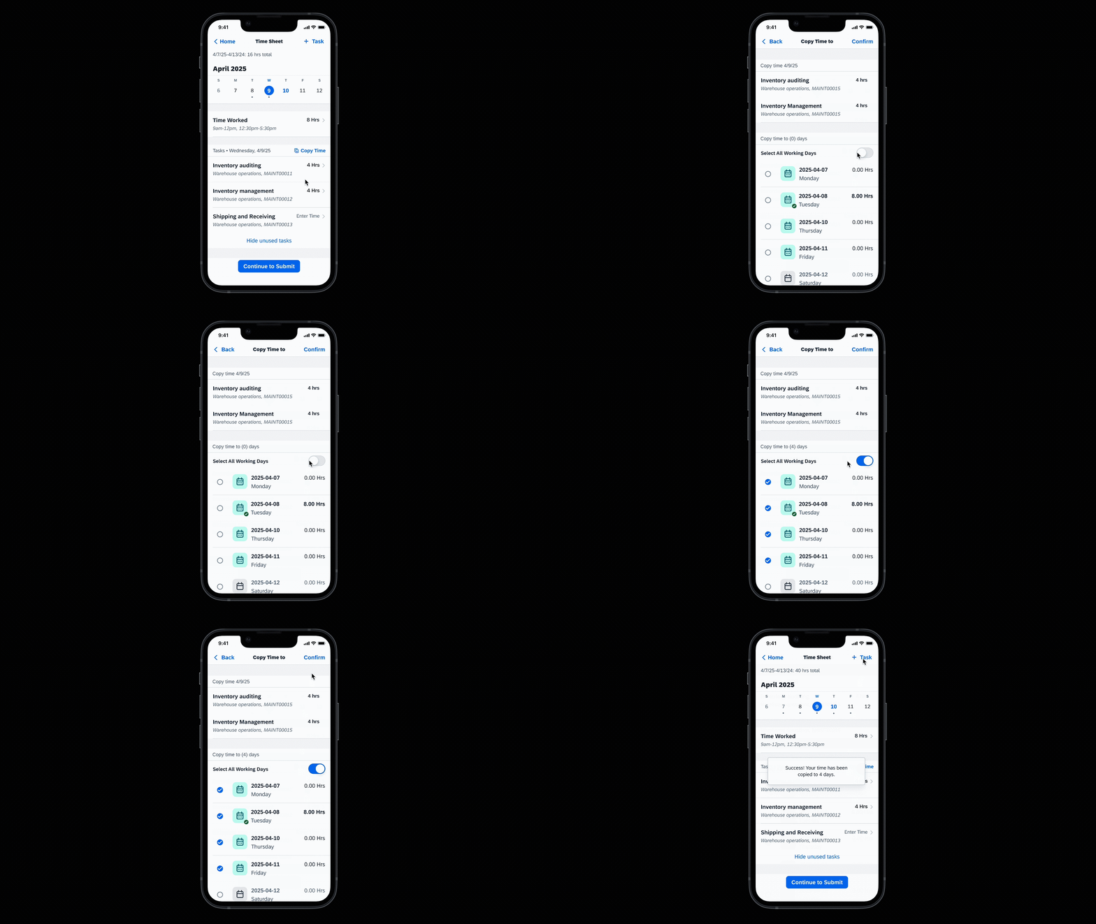
Introducing the copy time feature
Through research I discovered that the majority of workers were working the same tasks for the same amount of time each day. However, the existing app required them to manually enter their time every day. To make this easier, I introduced the ability to copy and paste time from one day to multiple days.
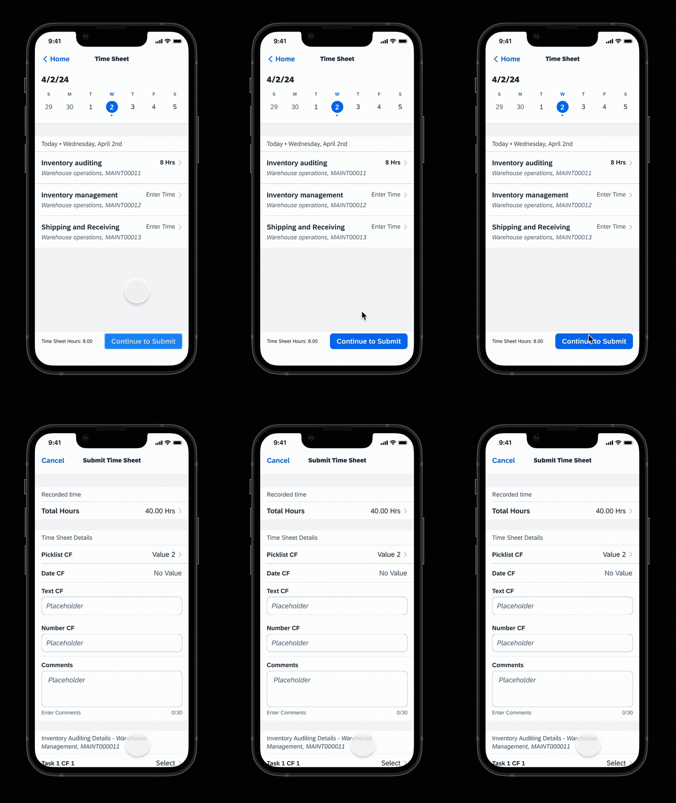
Using progressive disclosure to reduce information overload
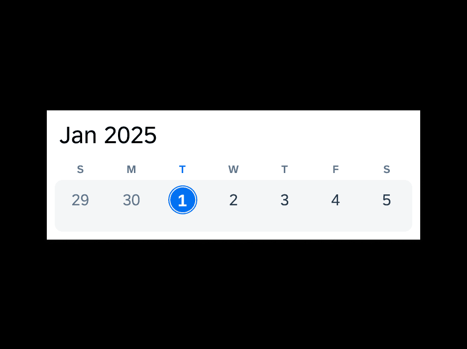
The existing application was criticized for having too much information on each page. To address this, I identified areas throughout the app where we could eliminate information or break it into separate sections. This reduced cognitive load by only showing the most necessary information at each step.
Adoption of modern design patterns
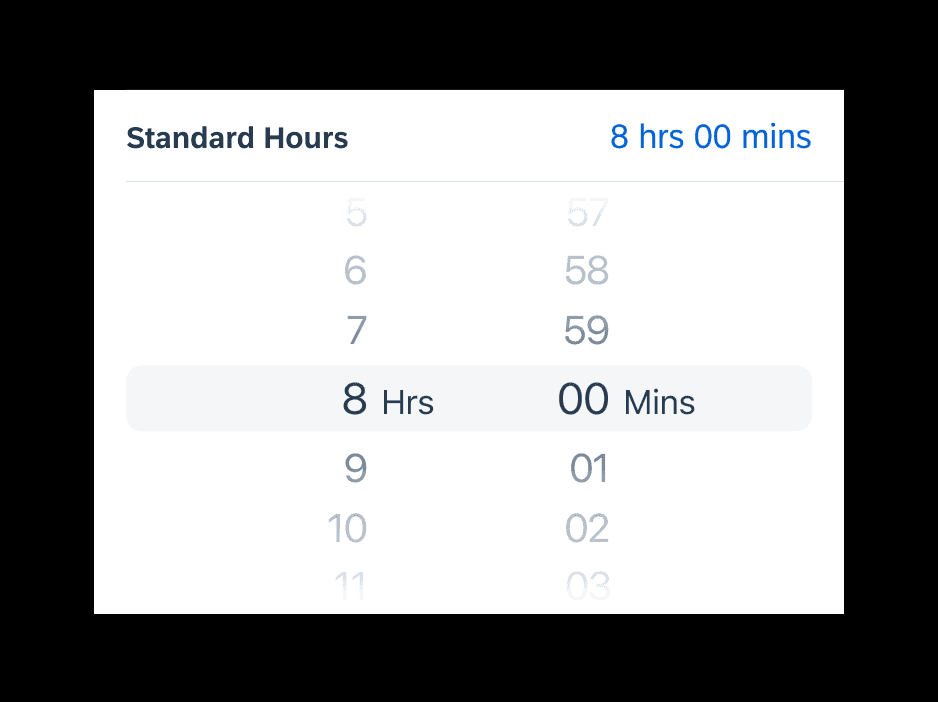
Another common complaint was that the app felt outdated. Today’s workplace tools are held to a higher standard. By updating core components with contemporary UI patterns, we significantly improved both usability and user perception.